


Hello Everyone,
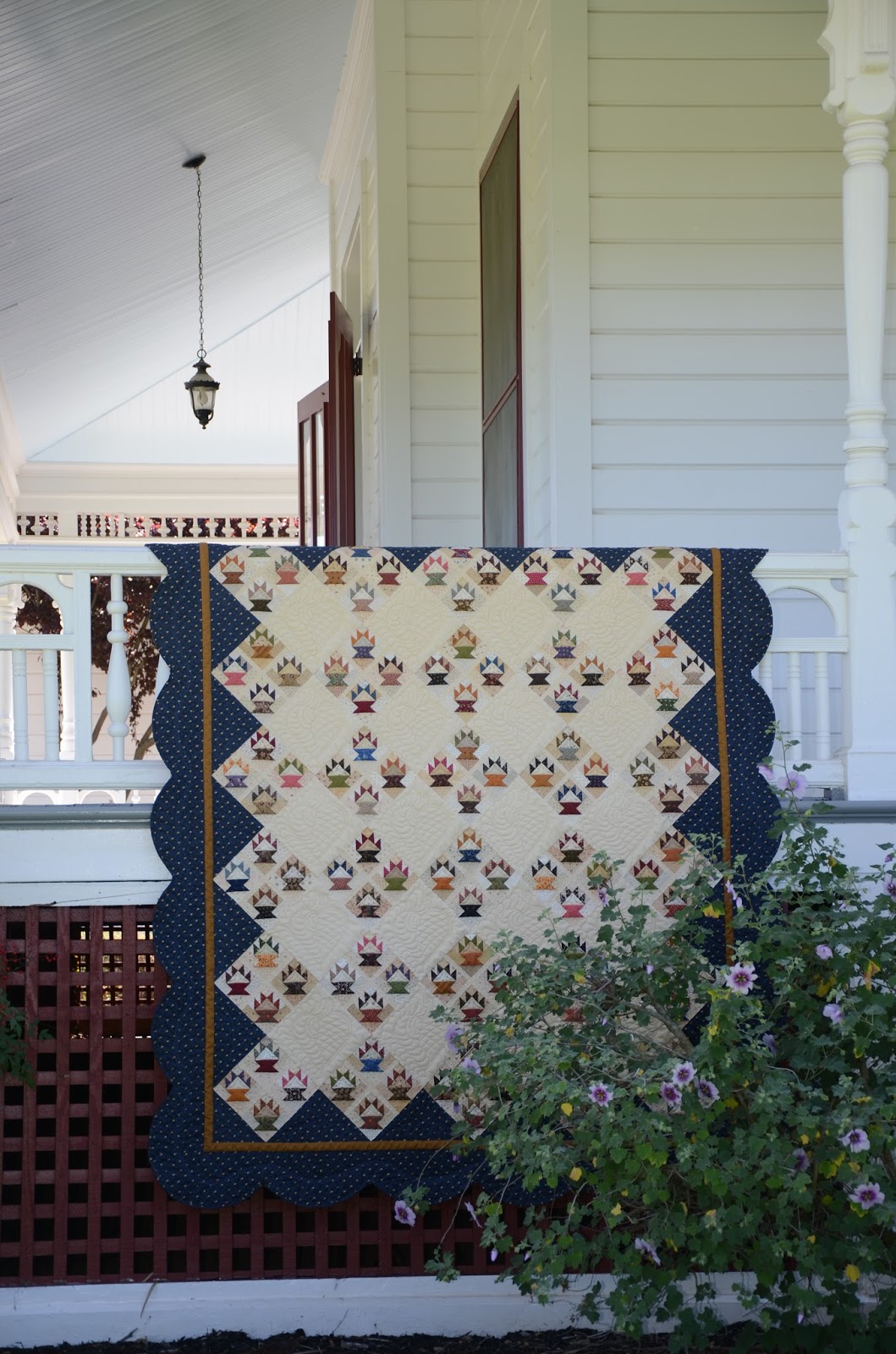
This post is going to be picture heavy.....my favorite kind of post! Mr. Joe and I headed out with For the Love of Baskets quilt in hand for a photo shoot at Ravenswood, the "Jewel of Historic Livermore."
 |
| #1 |
The docents were extremely helpful and we had full access to the estate.
 |
| #2 |
Ravenswood is a restored Victorian country estate located about two miles from our home in Livermore, in the heart of the Livermore Valley's wine country.
 |
| #3 |
The Buckley family spent summers at Ravenswood from 1885 to 1920, overseeing their 100 acre vineyard. This photo was taken at their winery.
 |
| #4 |
 |
| #5 |
 |
| #6 |
The buildings are beautifully restored.
 |
| #7 |
 |
| #8 |
 |
| #9 |
 |
| #10 |
 |
| #11 |
Why not have a quilt in a bathtub?
 |
| #12 |
I would imagine this old estate was a little drafty back in the day. All you would need is a nice quilt to keep you warm while sitting by the fire working on a needlepoint project while waiting for Mr. Darcy to come calling.
 |
| #13 |

Now readers, which photo should I use for the pattern cover? Should I do a collage and be really different? You are going to have decide for me and you'd better make it quick. I have to have these printed by Friday, April 19th. Each photo is numbered so you pick your favorite and put it in the comment section. Or, send me an email to patched55@comcast.net with your selection.
When you shop for patterns, what gets your attention? Is it the photo on the front? The size of the pattern? The cost? The artistry of the pattern cover? Do you want to see the whole quilt or not? I'm curious and I would like to know your thoughts.
The directions are written, and my PTD (pattern test dummy) my sister Gail, has been proofreading. So if there are any mistakes, just call 1-800-PTD-GAIL and issue your complaint. Seriously, if anyone ever finds an error in any of my patterns, please contact me immediately so I can dock Gail's pay! No seriously, for real this time, I really would like to know if anyone runs across an error so I can fix it immediately. I'm tired and getting a little goofy, so I'd best sign off for now.
Soon,
Lynn
Wow, For The Love of Baskets looks fantastic! Fabulous scallopped border and lovely photos. Must remember some of your photo ideas for next year when my quilt holder is away at college and I need a different way to shoot my work.
ReplyDeleteWow, Your quilt is amazing and all the wonderful photos, so fantastic to look.
ReplyDeleteGrit from Germany
Oh, how lovely! I would say the photo catches me first and the colors used in the quilt, then the price. The quilt in the tub is cute but I like the number 13 best. Really beautiful.
ReplyDeleteI prefer #4 or #6 for a cover. What a gorgeous quilt! I can't wait to get my hands on a pattern.
ReplyDelete# 10 and 6 are the ones I would look at the most if I were to make this pattern. No. 6 for the colours and shape of the quilt and #10 for the colours and the quilting!! Magnificent quilt!! The colours are wonderful!!
ReplyDeleteP
I love #'s 6 or 8 best! But the tree in #2 is amazing! I'd like to see that tree by itself~
ReplyDeleteThe quilt is gorgeous and that pattern should realy sell well!
♥♥♥
My pick is #4
ReplyDeleteI vote for a collage. I love all of the photos, esp the outdoor photos (2, 6, 8, and 10) and the one that really shows off the feather borders. What a beautiful quilt and the pictures are all fantastic. A great place to photograph it!!
ReplyDeleteFabulous! I think you should use as many photos of the quilt on your pattern as possible. As a quilt maker, I love seeing the quilt I'm making from different angles and in different lighting. It helps me choose fabrics and with the quilting after! Just beautiful!
ReplyDeleteCheery wave from
Bev
#6 or #10 would be my choice. They all are good tho. The quilt is stunning.
ReplyDelete#6 is my favorite but I love # 10 also. Maybe a combination of both ??? :) Georgouse quilt !!!!
ReplyDeleteWow what gorgeous pictures!! I am drawn to #10 for the cover. And I do usually decide from the cover and a lot of times if a Quilt shop has a sample made up in a different color way, it gives me more ideas on how to use the pattern. Great job on the beautiful quilt.
ReplyDeleteWhat a beautiful day to get some of your gorgeous photos, Lynn! I have to say the first photo that really struck me was #6 and I wasn't even thinking about pattern covers! I like that it was bright and showed the quilting. After looking back, you could crop the top off #10, brighten up the photo with your software and you would have the entire quilt! When I shop for patters what catches me is the design and probably the fabric used. To heck with cost! I hope to see at least a portion of the quilt on the front and maybe the whole thing on the back if it isn't on the front! Gosh - poor Gail has a lot riding on this pattern! Hope you picked up a nice bottle of wine or two for her at the winery - are you listening, Gail?
ReplyDeleteCheers!
I love Picture #6 first & then # 4 . I would use both of these pictures on your pattern cover ! It shows the details of the baskets & the quilting just beautiful!
ReplyDeleteWhen deciding on buying a a pattern the photo is the first thing , the fabrics used & then the price
Great photo SHoot !
Wow...it is beautiful.....i like #10 best I shows off the scallops.....which I love....way to go Lynn...
ReplyDeleteI like #10. No shadows and scallops. It is a beautiful quilt.
ReplyDeleteMary
It's stunning!
ReplyDeleteTo me...
#6 shows both the colors, the scallop edge and your quilting in one pic without being too bright or too dark.
#10 shows almost the entire quilt for total effect
#11 best shows the 3-dimensional aspect of your quilting and gives a sense of the finished quilt's size.
Maybe #6 on the cover and a collage of the others on the back???
I like photo 6 as well. It shows the quilt off enough so it would entice someone to purchase. Some of the other photos are very beautiful but make the quilt hard to see. It is a gorgeous quilt by the way and I love many of your designs and want to make them. I am a new quilter and am working on my first one. Once I have some skills and knowledge I will be purchasing your House on Edgewood Lane. I am also a new reader and have been working my way from the first post forward. What fun! I feel like I'm getting to know you and would love to come quilt with you. I wish I loved closer than Pennsylvania!
ReplyDeleteCathy @onecreativecouple.com
No. 4 or 10 seems to show it off best. Love it to bits.
ReplyDelete#2 is awesome. The pattern photo always reels me in.
ReplyDeleteWhat a gorgeous quilt! I love #2 the best, though the quilting does not show up well. And #6 for the quilting.
ReplyDeleteThe quilt is awesome and the background for all of the pictures is really unique. If I had to choose between all of them, I would go with #6. It shows off the piecing and the quilting beautifully. And, the background to the picture is lovely. The picture on the pattern is what draws me to the pattern and makes me buy it.
ReplyDeleteBeautiful and exquisite quilting! I like picture 6 it shows the scalloped edge, the feathers. You are so talented, and the pictures of the estate are wonderful.
ReplyDeleteIt's so beautiful and stunning Lynn.
ReplyDelete#2,3,6,8 are my favourites.#6 being the best.
What a beautiful spot to take the photos...
The pattern photo is what inspires me to buy the pattern..and If I have bought before from the designer, it's how well the pattern is written up....Yours are the best written patterns I've come across.
Julia ♥
Hi Lynn,
ReplyDeleteNumbers 6 or 10 would be my best choices, the colours are balanced and not washed out and show the overall design of the quilt.
A detailed picture of one of groups of baskets would be a nice idea say on the back or he corner.
I find with some of the other pictures that the surroundings take away from the beauty of the quilt and that is what you are wanting to to feature right?
In the end, it is your choice, I hope this helps.
Beautiful! #6. I like to see a close up of the quilt.#10 is ok, but I would cut the bush and get closer to the quilt. Just my opinion
ReplyDeleteI like the collage idea using 2, 4, 5, 6 and 10, with 6 and 10 being the larger pictures. The cover pictures are what draw me to a pattern when browsing.
ReplyDeleteLynn,
ReplyDeleteWhat a beautiful setting to show off your stunning quilt!! I like the setting for # 10. When I choose a pattern, it is usually because of the photo on the front and the sizes offered. It is sad that sometimes a quilt that is finished will not appeal to me because of their color selection.
You've definitely got a beauty with your basket quilt!
This is your pattern test dummy reporting for duty! You mean I now have to decide which photo I like best? I think proof reading is easier! I love them all but if I had to choose one it would be #2. This is another stunning creation, Lynn, and I know it will be a "home run" for sure! Oh, and by the way, I like Candace's idea about the wine!
ReplyDeleteI love No 6. It is so good to see the quilting detail as well as the pattern. What a beautiful, classic quilt.
ReplyDeleteI especially liked #13 because it showed the beautiful inside of the house, but #10 was good too. What a beautiful quilt! I love the store (In Between Stitches) and Livermore too. My friends and I are going to the Paris Flea Market in June.
ReplyDeleteWhat catches my eye is the look of the quilt and whether I can see it as mine. I love baskets and this one is very cute!
Looking forward to seeing the pattern in the store. Good luck.
When I'm looking at patterns, I definitely like to see a full, flat shot of the quilt, maybe on the back cover, but on the front I like to see more styled shots. My suggestion would be 13 on the front, and maybe a collage of 2, 6 and 8 on the back.
ReplyDeleteThe front photo is definitely the first thing I look at, but I must say I never look at the size, as I just think I'll adjust the number of blocks etc to suit myself.
Taken all-in-all, my comments probably aren't very helpful really are they?
I prefer #2 and #4 - the photos are all lovely, but some of them don't highlight the beautiful scalloped border as much. I like to see a full size photo - stylized shots are lovely, but I think they work best in a magazine where a flip of the page shows the full size "flat" photo. I might reference the size after the fact and decide whether to add or delete blocks to suit the size I want, but that's rarely my first consideration. The quilt is amazing!
ReplyDelete